



Most school data presentations fail before the first slide loads. Not because leaders lack data—they're drowning in it. The failure happens when principals show up to board meetings with 47-slide decks full of color-coded graphs that prompt exactly zero decisions.
The gap between having data and using data to drive action is massive across K-12 schools. You've probably sat through presentations where attendance rates, test scores, and behavior incidents get displayed in elaborate dashboards while actual problems go unaddressed. Teachers keep struggling with the same challenges, and improvement initiatives stall out after the meeting ends.
What actually works is simpler and more focused than most schools realize. The pattern is pretty consistent: effective data visualization for school leaders follows specific rules around sampling, visual design, and narrative structure that traditional education dashboards completely ignore.
Why Traditional School Data Dashboards Create Analysis Paralysis
School leaders face a fundamental mismatch between the data they receive and the decisions they need to make. District dashboards dump comprehensive datasets—every student, every assessment, every metric—into elaborate visualizations that look impressive but obscure actionable insights.
A typical scenario: the principal gets monthly reports showing overall math proficiency at 67%. The dashboard breaks this down by grade, by demographic group, by standard. Fifteen pages of charts later, everyone agrees math needs improvement. But which specific intervention should they implement? Which teachers need support? Which student groups need immediate attention? The dashboard doesn't say.
School leaders make two types of decisions in practice: immediate interventions (this week) and systemic adjustments (this semester). Neither requires analyzing every data point. Both require understanding specific patterns in manageable samples that connect directly to available resources and realistic timelines.
Traditional dashboards evolved from district reporting requirements, not leadership needs. They prioritize compliance documentation over operational improvement. That's why principals spend hours generating reports that satisfy state requirements but provide minimal guidance for Monday morning's leadership team meeting.
Small-N Classroom Sampling: Getting Signal Without the Noise
The breakthrough comes from abandoning comprehensive analysis in favor of strategic sampling. Small-n classroom sampling means deliberately choosing representative slices of data that reveal patterns without overwhelming analysis capacity.
Keep every student on track with ease.
Skolyly helps you create, assign, and monitor classroom activities efficiently.
- Integrated lesson and assignment management
- Real-time student progress tracking
- Automated class scheduling & notifications
No credit card required
Take reading assessments. Instead of analyzing all 600 students' scores every month, you identify three representative classrooms at each grade level—one typically high-performing, one average, one struggling. That's roughly 270 data points instead of 600, but the patterns become immediately visible. You can spot whether interventions are working, whether certain grade levels need support, whether specific teachers have figured something out that others haven't.
In a school with 20-25 students per classroom, sampling three classrooms per grade gives you 60-75 students per grade level. That's 40-50% of your population—statistically solid enough to identify real patterns while remaining small enough to analyze during a single planning period.
Here's what makes small-n sampling work operationally:
Sample Selection Rules:
-
Choose classrooms, not random students (maintains teaching context)
-
Include a range of performance levels at each grade
-
Rotate samples quarterly to prevent blind spots
-
Document which classrooms you're tracking (transparency matters)
For behavior data, the approach shifts slightly. Sample by time rather than by student. Track all incidents during specific weeks rather than trying to analyze every incident all year. Week 3 of each month becomes your behavior sampling period. Patterns emerge quickly: Monday spikes, lunch problems, specific hallway congestion points.
The power isn't just in reduced data volume. Small-n sampling forces focus on patterns rather than individual outliers. When you're looking at three classrooms instead of twenty, you naturally start asking system questions: What's different about Mrs. Chen's approach? Why do all three sampled fifth-grade classes struggle with the same standard?
The Three-Chart Maximum Rule for Board Presentations
Board members and leadership teams have maybe twelve minutes of genuine attention for data analysis during a meeting. The pattern is pretty clear after watching enough presentations succeed and fail: three charts maximum, or you lose the room.
This isn't about dumbing down analysis. It's about cognitive load and decision architecture. Human brains can hold roughly three complex ideas simultaneously while making decisions. Add a fourth chart, and people start forgetting the first one. Add a fifth, and they've mentally checked out.
The three-chart structure that consistently drives decisions:
Chart 1: The Baseline Reality Shows where you are now versus where you need to be. One metric, one visual, clear gap identification. A single bar chart comparing current reading proficiency to state standards. Nothing fancy—just the undeniable reality.
Chart 2: The Trajectory or Pattern Reveals whether things are improving, declining, or stuck. A line graph showing a six-month trend, or a scatter plot revealing correlation between attendance and achievement. This chart answers one question: is what we're doing working?
Chart 3: The Decision Point Presents the specific choice requiring action. Often a comparison chart: Option A versus Option B, or current approach versus proposed intervention. Include resource requirements directly on the chart.
| Chart | Description |
|---|---|
| Chart 1: The Baseline Reality | Shows where you are now versus where you need to be. One metric, one visual, clear gap identification. A single bar chart comparing current reading proficiency to state standards. Nothing fancy—just the undeniable reality. |
| Chart 2: The Trajectory or Pattern | Reveals whether things are improving, declining, or stuck. A line graph showing a six-month trend, or a scatter plot revealing correlation between attendance and achievement. This chart answers one question: is what we're doing working? |
| Chart 3: The Decision Point | Presents the specific choice requiring action. Often a comparison chart: Option A versus Option B, or current approach versus proposed intervention. Include resource requirements directly on the chart. |
Notice what's missing: comprehensive breakdowns, detailed subcategories, elaborate color coding. Those belong in appendices for people who want to dig deeper. The presentation itself stays focused on driving specific decisions.
A middle school principal recently transformed her board's response to intervention proposals using this approach. Previous presentations included 22 slides of data. The new version: three charts showing current failure rates, trajectory if nothing changes, and projected improvement with targeted intervention. The board approved funding in eight minutes.
Building Slide-Ready Visuals That Actually Get Used
Most school data visualizations fail the screenshot test. Try it: take a screenshot of your dashboard and paste it directly into a presentation. Can you read it from ten feet away? Does it make sense without explanation? Would a board member understand it in five seconds?
Slide-ready visuals follow different rules than analytical dashboards. They prioritize clarity over comprehensiveness, impact over accuracy to the decimal point.
Design principles that work:
-
Text size minimum 24 points. Sounds obvious until you see principals squinting at 8-point axis labels during presentations. Every element—titles, labels, legends—must be readable from the back of the boardroom.
-
Color with purpose, not decoration. Two colors maximum for most charts. One for current state, one for comparison or target. Save red exclusively for critical issues requiring immediate action. That spreadsheet rainbow of twenty different colors guarantees confusion.
-
Progressive disclosure through animation or builds. Start with the basic shape of data, then add layers of detail. First slide: overall math scores. Click: breakdown by grade appears. Click: gap analysis overlays. This prevents overwhelming viewers while maintaining depth for discussion.
-
Remove every unnecessary element. Grid lines, decorative borders, 3D effects—they add cognitive load without adding value. The data should be the only thing viewers are processing.
Here's a practical example. Original chart: elaborate stacked bar graph showing discipline incidents by type, grade, location, and time of day. Sixteen different colors, tiny labels, requires two minutes of explanation before anyone understands it.
Slide-ready version: simple heat map. Rows are locations (classroom, hallway, cafeteria), columns are time blocks (morning, lunch, afternoon). Color intensity shows incident frequency. One glance reveals cafeteria lunch as the hot spot. The decision becomes obvious: deploy additional supervision during lunch.
The technical execution matters too. Export at high resolution (300 DPI minimum). Use vector formats when possible—they scale without pixelation. Build templates in your presentation software so consistent formatting happens automatically instead of being recreated every time.
One-Page Narrative Briefs: The Missing Link Between Data and Action
Numbers without narrative create confusion. Narrative without numbers lacks credibility. The one-page narrative brief combines both into a document that drives specific actions.
The format is deceptively simple. Top third: the situation in three sentences. Middle third: the evidence in bullet points with specific numbers. Bottom third: the required decision and timeline.
A real example from an elementary school:
Situation: Third-grade reading intervention isn't working. Despite six months of targeted support, 43% of struggling readers showed no improvement on monthly assessments. The current pull-out model disrupts math instruction and creates scheduling conflicts.
Evidence:
-
Sample of 24 struggling readers across three classrooms
-
10 students (42%) showed no gain in reading level
-
8 students (33%) missed an average of 3.5 math lessons per week
-
6 students (25%) improved one level or more
-
Cost
1.5 FTE intervention specialists, approximately $95,000 annually
Decision Required: By November 15th: Approve shift to push-in model with intervention specialists working inside classrooms, or maintain current pull-out model with schedule adjustments. Resources remain constant; implementation changes only.
Notice what this brief accomplishes. It frames the problem clearly, provides specific evidence from manageable samples, and defines exactly what decision is needed and by when. No overwhelming data dumps, no vague recommendations.
The one-page constraint forces precision. Every sentence must earn its space. That limitation actually improves decision-making by cutting out the noise that typically surrounds school data discussions.
Building on data-driven cycles from classroom evidence becomes more effective when each cycle produces these focused briefs rather than lengthy reports.
Converting Analysis Into Specific Board and Staff Actions
The gap between analysis and action kills most school improvement initiatives. Beautiful dashboards generate thoughtful discussions that lead to vague commitments that produce no operational changes.
If-Then Decision Rules
Present data with pre-negotiated responses. "If chronic absence exceeds 15% in any grade, then the principal schedules a parent engagement meeting within two weeks." The board doesn't debate whether to act—they've already decided. The data simply triggers the predetermined response.
Resource-Linked Visuals
Every chart showing a problem includes resource requirements for solutions. Reading scores lagging? The same slide shows the cost for an additional literacy coach, hours for teacher training, or materials for new curriculum. This prevents the common pattern of identifying problems without committing resources.
Assignment Matrix
Final slide of every data presentation: who does what by when. Not "the math department will explore options" but "Ms. Rodriguez analyzes three curriculum alternatives, presents recommendation October 20th, implementation decision by October 27th."
This workflow illustrates how data triggers lead to assigned actions.
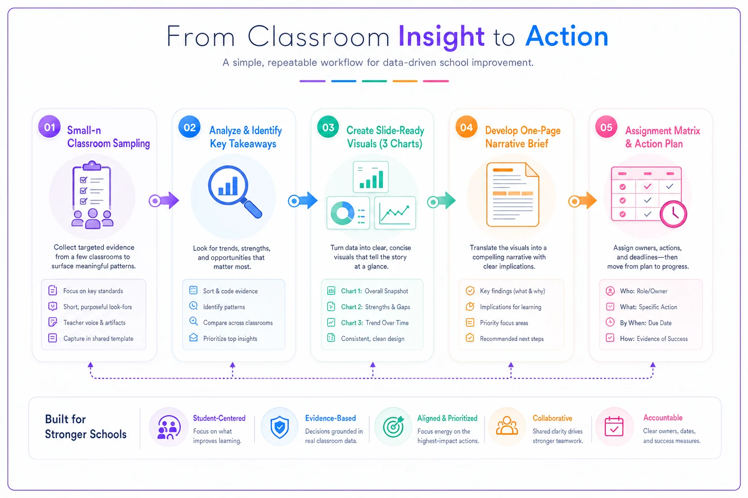
A suburban elementary school transformed their data meetings using this approach. Previous format: two-hour discussions reviewing dashboards, general agreement about problems, no specific commitments. New format: 30-minute presentation, three decisions required, specific actions assigned before anyone leaves.
Their chronic absence data presentation included three slides. Current absence rates by grade (visual one). Correlation between absence and reading scores (visual two). Resource requirements for an attendance intervention specialist versus automated parent notification system (visual three). Decision: fund the notification system, implement by November 1st, measure impact in December.
The key is eliminating the space between seeing data and committing to action. Traditional presentations end with "let's think about this and reconvene." Effective visualization ends with "John starts this Monday, Sarah orders materials tomorrow, budget approved."
Moving Beyond Compliance Reporting to Operational Intelligence
Schools generate massive amounts of data for compliance purposes. State reports, federal requirements, district dashboards—most of this gets collected, submitted, and forgotten. The same data, reframed for operational use, could drive actual improvements.
The shift requires changing what you measure and how you present it. Compliance reporting counts things: number of students tested, percentage meeting standards, hours of instruction delivered. Operational intelligence identifies patterns: which intervention strategies work, when students disengage, where resources generate the most impact.
Consider attendance data. Compliance version: average daily attendance is 94.2%. Operational version: Tuesday/Thursday absence patterns indicate specific students with external obligations, afternoon absences spike in rooms without air conditioning, chronic absence correlates with bus route #7's frequent delays.
The visualization changes completely. Instead of showing monthly attendance percentages, you create heat maps revealing patterns. Instead of demographic breakdowns, you show intervention impact. Instead of year-over-year comparisons, you display resource allocation effectiveness.
The tools for this don't require new software. Spreadsheet programs can create heat maps. Presentation software can build interactive charts. The change is mostly in mindset—moving from documenting what happened to understanding why it happened and what to do about it.
Practical Implementation in Resource-Constrained Schools
Most schools don't have dedicated data analysts. Teachers have full courseloads, administrators juggle multiple responsibilities, and IT supports basic operations. So how do you implement effective data visualization with realistic resources?
It starts with automation and standardization. Build templates once, use them repeatedly. Create data collection forms that automatically populate visualizations. Design standard brief formats that require only updating numbers and recommendations.
A Title I middle school built their system using basic tools:
-
Google Forms for data collection (automatic timestamps, no manual entry)
-
Sheets with pre-built formulas and charts (updates automatically)
-
Slides template with linked charts (refreshes when data updates)
-
One-page brief template in Docs (fill-in sections, consistent format)
Build the slide and brief templates once and store them in a shared drive so teams only update numbers each week.
Total setup time: one professional development day. Ongoing maintenance: around 45 minutes weekly for data review and brief creation.
The sampling approach makes this manageable. Instead of analyzing all students monthly, they rotate through grade levels. Week one: sixth grade sampling. Week two: seventh grade. Week three: eighth grade. Week four: synthesis and presentation prep.
They also distributed the work. Department chairs own their subject area samples. Grade-level teams review behavior patterns. The assistant principal compiles briefs. Principal presents to the board. No single person carries the entire analytical burden.
The automation extends to action triggers. When specific thresholds get hit—attendance below 92%, behavior incidents above 5 per week, assessment scores below targets—automated emails alert relevant staff with pre-written action steps. No waiting for monthly meetings to identify and address problems.
Teachers see immediate value because the system identifies students needing support without adding paperwork. Administrators get decision-ready information without hours of analysis. Board members receive clear, actionable presentations rather than data dumps. That's what drives actual adoption.
Transforming School Operations Through Focused Visualization
The schools that successfully use data to drive improvement share common characteristics. They abandoned comprehensive analysis in favor of strategic sampling. They limit presentations to three critical charts. They produce one-page briefs that demand specific decisions. They build action triggers directly into their visualization systems.
These aren't necessarily the schools with the biggest budgets or most sophisticated software. They're the schools that recognized a fundamental truth: operational improvement requires operational intelligence, not compliance documentation.
A rural elementary school started with basic sampling of reading assessments. Three classrooms per grade, assessed monthly, patterns identified quickly. They discovered their intervention program worked well for students reading one level below grade but failed almost completely for students two or more levels behind. This insight—invisible in aggregate data—led to differentiated intervention strategies that improved outcomes across the board.
An urban high school focused on behavior incident patterns using time-based sampling. Tracking all incidents during sample weeks revealed that roughly 70% happened during transitions between specific classroom pairs with awkward traffic flow. Moving two classes to different rooms reduced incidents by around 40%. No new staff, no additional programs—just a simple operational adjustment.
The transformation doesn't require revolutionary changes. Start with one grade level or department. Pick three key metrics. Build simple templates. Create clear decision rules. Generate focused briefs. Assign specific actions.
What makes this approach work is its operational focus. Every visualization connects to available resources and realistic timelines. Every analysis leads to specific decisions. Every presentation drives committed actions.
Schools already have the data they need. What's missing is the discipline to sample strategically, visualize simply, and connect analysis directly to action. The three-chart rule, one-page briefs, and action triggers aren't just presentation techniques—they're operational tools that change how schools use data to improve outcomes.
Your next board presentation doesn't need forty-seven slides. It needs three visuals that reveal critical patterns, a one-page brief that frames the decision, and an assignment matrix that ensures follow-through. The data visualization practices that actually drive school improvement are simpler than most leaders realize—and more powerful than traditional dashboards ever delivered.
Ready to elevate your classroom management?
Join 5,000+ educators using Skolyly to save time, engage students, and improve learning outcomes.